Loading 


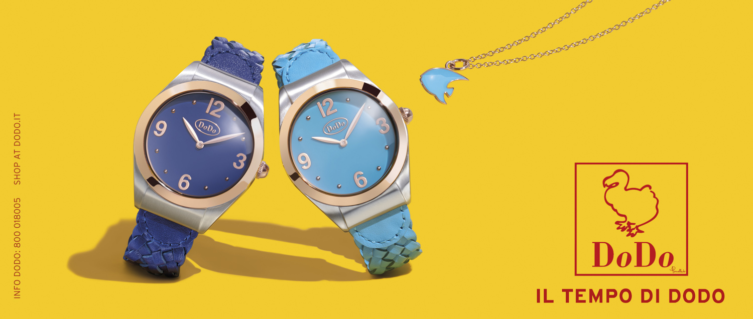
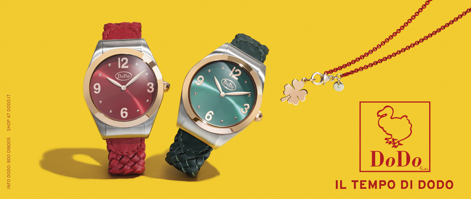
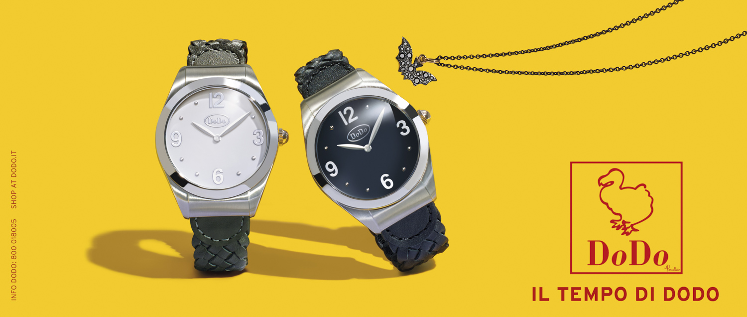
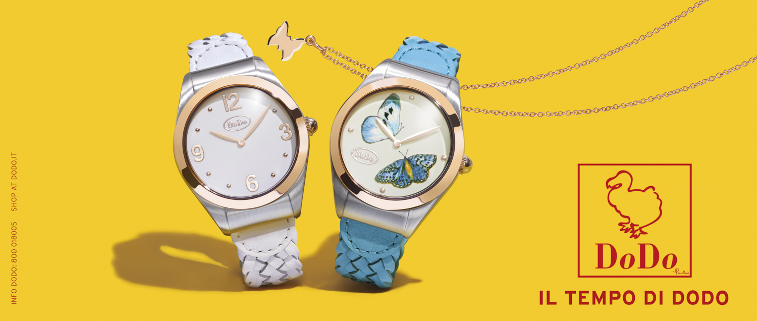
The request to work on the Watches campaign for newspaper front pages led us to think according to a process of differentiation in terms of visual communication. We imagined the watches as a couple within a temporal context in dynamic situations. We gave them parts to play: lovers, friends, companions. They play, meet, dance and move apart. Adopting a playful visual code, we tried to find an interpretation that could restore time as an element of joy and lightness. The choice of yellow as the background colour not only fits the narrative, but also serves perfectly as an eye catcher in the newspaper layout.
Brand:
DODO
Project:
ADV NEWSPAPER DODO WATCH 2015
Photo:
BODHA & GILDA
Set Design:
FLY IN PRODUCTION
Digital Retouch:
TEA DRAGANO


